Nursel Music Logo
This was a re-branding project for a Gospel Artist, who does praise, worship, happy and dance music as part of the message of her core values - hope, faith, love and joy. I was challenged to complete the project within a shorter timeline due to the needs of the client. I was able to work really well with Nursel to create the final logo design that we were both very pleased with.
The Ideation
After going through some of the specs for the project, I started by just sketching out a range of different ideas I had in mind. I also gained ideas from some reference images I found based on the adjectives the client gave me about her brand. I made sure to explore all angles for ideations of the logo, and I played around with alternative versions of the ideas I already had too.


The Concept Ideas
To make things easier for the client, I chose my top options out of the sketches for the logo concepts and designed them digitally. I was able to use the grid to have more accuracy with the spacing of the designs. I kept them black and white to emphasise their contrast and to see if they work in their simplest form before moving forward with one of them.

Logo Mock-ups
Once the preferred logo design was chosen, I found some free resources to use for the mock-ups that were requested, as my client also sells her own merchandising. This helped her to see how the logo would be viewed since it would be printed onto different items, and she agreed that it would work well.
Finalising the Design
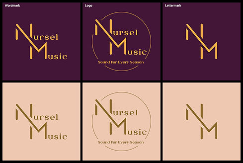
When the client chose which logo design I should work with, I made some slight changes with the spacing and the legibility of the letters. Then, I also chose a range of fonts I had found earlier in the project to allow for the client to decide on. After this, I tried a range of different layouts for the logo design and incorporated some ideas from the references I found which influenced me to work with the circle for the final design. The client had given me two colour palettes that she wanted me to use, so I worked with those colours and added them to the concepts as she had requested.
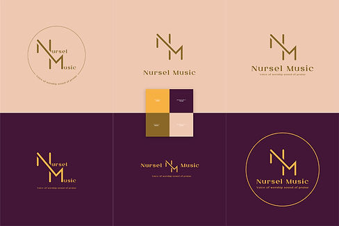
Final Logo Design
My client had spent some time improving the slogan and so I added it to the final design, and then I finalised the files with the two colour sets as requested by the client. In the end, she had three versions of the logo to use for different physical and digital platforms. I was able to learn and grow as part of my workflow, as this project had a shorter deadline than my others. This was a great project that challenged me to focus on more unique ideas that would embody the brand of my client, and it helped me to develop good critical thinking as well.