
Humble Flavours eBook
This was my second opportunity to work on a cookbook, this time for an e-book that was published free for my client's target audience (students). My client has a brand with an online presence so I was able to use their brand identity as we co-operated on this project.
The Front Cover
My client gave me the specs for how she wanted the eBook to be like and she had a draft layout that she wanted to use: a minimalistic design. So, I was able to recreate it in InDesign and I altered the layout to fit well in the space she chose, with the text being aligned together and to the right side. Then, I was able to use Photoshop to crop her out of the picture she gave me, and afterwards, it was her idea to add a contrasting white version to act as a shadow. After confirming the fonts and design with her, I also added the border line around the page to make it stand out especially when compared to the other pages.

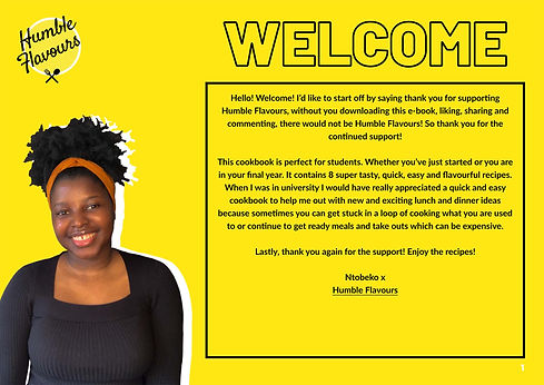
The Welcome Page
This was also based on her concept for the page and I just followed the steps to add a different photo of her to the page and also continue the font style of a black border with no fill. I first set up the page and then later she gave the text to add in, so I had the idea to then create a hyperlink to allow people to visit her website. She loved the idea and I just made sure that the appearance of the hyperlink was one that she liked, which was the underlined text.

The Recipe Pages
The recipe pages all had the same design just to follow its continuity and because they are simple and easy to use recipes, we both thought it didn't need to be too complicated with alternative pages. So, I was able to use the design concept from my client to recreate the layout and I made some suggestions to improve it such as adding a bar to display where the method is so that leaves more space for the main body of text. I also used white text on the yellow backgrounds and black on the white background to create a nice contrast, with yellow for the title to follow it continuity of the yellow theme. I suggested to add a section for the meal preparation time, cooking time and amount of servings with some icons to compress the information into a readable format. Then I also suggested another section for any additional information, which filled some of the white space of the page with a 'Did you know?' or 'Serving Suggestion!' title. Lastly, I added a yellow box for the page number to stand out and had a white font colour to contrast with the page.
The Contents page
When I made this page, I was able to structure it from her layout concept and to just alter a few different things around to enhance the design. I suggested a few different ideas for the contents list and to number the pages they were on, then she chose the one that listed the pages to the left and named the page next to each one. Then I placed some boxes to be placeholders until she would sent the images she would take later on, and also added a line to separate the title from the list with a contrasting white colour. Lastly I suggested to add some hyperlinks for her audience to go directly to that recipe page they are looking for.

Photo Manipulation
For the recipes, my client wanted the backgrounds removed so that the food was the only part of the image on each page, which added to the eBook's minimalistic look and highlighted the food. So, I was able to use the Camera Raw plugin in Photoshop to enhance the image's appearance and then I used the selection tool to do the same process that I did with her photos from the front pages. Then, I used the original edited images to then add to the contents page to give a visual for the audience to see the recipes in the eBook.
