
BIBLE APP RE-DESIGN
For this project, I went under a process to improve the design and functionality of the You Version Bible App. I myself use this application regularly and wanted to see how I would further develop its features for the needs of other users.
You can check out the full prototype I created here
Reviews from Google Play
To start, I did some research into the current users pain points by going to the app's Google Play reviews. This gave me a broad range of reviews which helped me to understand some of the users and their experiences with the Bible App. As I continued to log what problems or suggestions that users had, I was able to pinpoint a select few that would improve the user's experience.


Competitive Analysis
I did some research into other competitors and tested these applications to see how they functioned and what features they had, or ones they didn't have compared to the You Version Bible App. This helped me to thoroughly evaluate how the other Bible-based applications worked and what made them stand out. Also, I was then able to use some of the features as inspiration for the ideas I would create for the improvements of the Bible App.
Wireframe Sketches
With the help of the research I had previously done, I was able to then come up with ideas for the different sections that had improvements based on the selected reviews. I played around with a few different thoughts I was having on how the designs should look, and I wanted to sketch ideas that would fit with the style of the app to not cause confusion with the users.

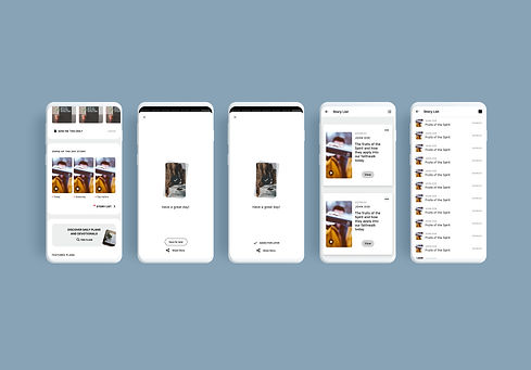
Home
In this section, I decided to go with the outlined button because it would catch the user's eye and it looked more clear that it was a clickable button. I also used the 'saved for later' button, which is usually shown when saving a plan, so that it has that consistency and familiarity with the users. For the story list, I was able to base my designs on the prayer list and so that also was based on having a consistent design/functionality for the app.
Profile
With the profile section, I designed it to include a filter button to open up an overlay, which is based on the Bible search filter overlay from the Bible section. Since the highlights, bookmarks and notes can be made with different colours, I used the same colour system in the filter as the one in the Bible section. I also added the options to change the order of the date you created it and the Biblical chronology. This would help users to filter through highlights, bookmarks and notes they have made with specific colours, or the ones they made a long time ago, without having to scroll through them all.


Bible
With the top bar, I rearranged and added some options for the buttons. The cross-reference button would open up the split screen mode and have a black outline to show users that it's active. I moved the formatting button into a small dropdown menu along with an undo and redo button so users can go back and forth between the scriptures they read. For the audio overlay, I added a loop button with three modes (loop off, on verse, and on chapter) so users can listen to the parts of the Bible they want on loop. I created an overlay when pressing each Bible link to ask the user if they wanted to open it in the primary or secondary window, so they can choose where they might want to cross reference. For the Bible search section, I added a 'sort type' filter option for users to see the search results in chronological order or by relevance of the keyword they typed.
Plans
I created two tabs for users to prioritise their plans into saved plans they seek to start soon and plans saved for a later date. So I made an overlay for when saving a plan, to ask the users which list they want to save it to. I also designed the plans to go into edit mode for when users press and hold the screen, which allows them to select plans to either share, move or delete. Then, I also made an overlay to prompt them if they are sure they want to proceed with the action so that they could cancel if they made a mistake.
