
Amazon Email RE-DESIGN
Amazon is one of the biggest technology companies in the world, developing and growing to accommodate to different services. As for it's main e-commerce service, its email design may seem quite outdated and crowded with a lot of text. Or some might say that it has a timeless layout and therefore doesn't need to be changed. Whatever the argument may be, I challenged myself to update and improve the designs for the primary emails that most users would see.
Wireframes of Current Amazon Emails
I first sought to gather different emails and eventually grouped them into 3 main categories: order (including delivery), review and account. I then made these mid-fidelity wireframes to show the content and layout of the emails that I have received over the past year. I would argue that, although their emails give users all the information they might need, it becomes hard to tell what information is immediately essential to the user based on the subject of the actual email. Also, some of them had differences, even within the same category, and had a change in layout or variations of the same type of email.


Wireframe Sketches
After deciding on the categories and looking through the email designs, I decided to sketch out some ideas as low-fidelity wireframes. My aim with these concept sketches were to keep it simple, cohesive (layouts, colour scheme etc.), and to be focussed on the most important information for the users. So, I tried to keep it quite consistent with what users are used to with the layout, but I came up with ideas to compress and re-shape what was portrayed to the user. I also had some ideas from other emails that I had seen before, which helped me to elevate on the layouts further and come up with ones that would translate well with Amazon's current style.
Final Wireframes
I then transferred the best options I found, which suited the objectives I set out to accomplish, into mid-fidelity wireframes to see what could work the best. I tried out a few different layouts before finalising on these designs, which I felt were more concise with the reason behind a user receiving the email, whilst also being faithful to the content of the original designs. When I was happy with the way the layout looked, I also sorted out the spacing so that I could easily use this a guide when using real content in the final designs.

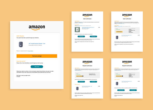
Order Designs
Since the 'order' designs were the ones with a lot of information, I made use of the buttons which effectively helped to decrease a lot of the space and to guide users to the main areas of support they may need with their product. I also made use of a standard signing off message based on what was already on one of Amazon's current emails. I decided to use this message on most of my designs as a place holder and to establish a form of human connection, rather than having no real communication between them. Then, with the delivery design, I merged a few ideas from their current designs as well as a different source. This helped me to use what was already working and to then also allow users to review how their delivery went, without limiting them to just 2 options (good or bad).
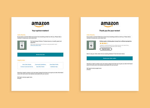
Review Designs
The 'review' designs were also quite extensive and so I reduced the content to include what Amazon would require from the user, and also what would be helpful to the user. I believe that this would be more effective for the process of a user remembering what they purchased; choosing to review that purchase, and also checking other variables concerning their review or any other resources. For the review confirmation email, I kept it quite similar to the one they currently have and I just modified it with a more structured layout. Then, I just made the call-to-action buttons to be more distinct and clear for users to be drawn towards interacting with those actions.

Account Designs
With these designs, I thought I could make them more consistent with their layouts and also presentable with the portrayal of the information. I took inspiration from how Epic Games presents users with their authentication code, so I made a container where the main text would be and aligned the content to the centre. Although centred text isn't the best for readability, I used it here because the sentences are short so it would be more legible and also because the main elements are in the middle (code and 'reset password' button). This made the overall design look more appealing as well and to be differentiated from the other categories of emails. I also added the button based on some other 2-step verification or password authentication emails so that users can reset their password in case it wasn't them who requested the code or changed their password.